Mountain to Climb Updates - Convergence Explorer
This was something I had worked on before. I’ve just given it a new update. It’s an easy way to see how and when different places, like Poland and the United Kingdom, will converge, and when Poland will be richer than the United Kingdom on a per capita basis.1 You could do this for other regions. There are some regions that are quite surprising. I find Kazakhstan is richer than most people would imagine.2 A lot of the European Union states that joined in 2004 have converged in major ways, particularly the Baltic countries, but it’s kind of true of all of them.3 You get a sense as well that growth in Romania is dramatically underrated.4
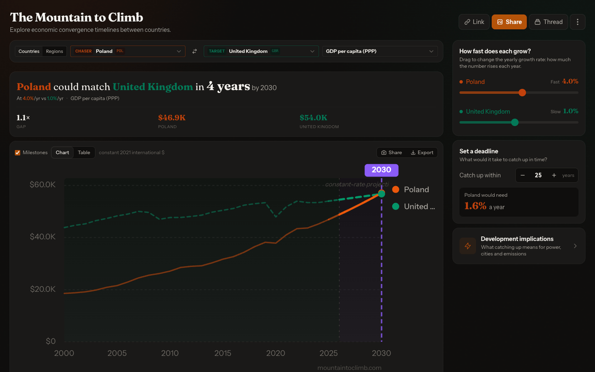
The Convergence Explorer is a tool that I built for myself because it is quite an easy way to see how different rates of economic growth impact convergence for different areas and different regions, and it kind of remaps your sense of the economic geography of the world and where we’re going. Inspired by what Oliver Kim has done, this is an ongoing little project.5 I’ve made some new updates to the sidebar. The footer was tidied up a bit. There were some translation strings that were missing. And I’ve updated it with new data from the last year from the World Bank,6 and some extra information from Ember, who do really excellent work tracking the energy transition.7
Ember had a nice API that I was able to plug into. I’ve made it so the tool sits more or less in one viewport, because it was something I wanted and it’s focused on just one thing. There are some elements I’m unsure about. I might actually tidy up the sidebar and remove it, because I think it’s perhaps a bit overly technical, and it doesn’t convey the point: the connection between energy deployment and economic growth. It would be interesting to add a compute piece to it and the build-out of compute, but I don’t know the best reliable data source for that.8
Related Thoughts
- Mountain to Climb: the original write-up of the tool, covering the country and regional modes and the implications panel.
- Cheaper Code Should Mean More Experiments: why a small tool focused on one question is worth building when code is cheap.
- Building Explainers Random Thoughts - Drone 101: another interactive tool for building intuition by adjusting the inputs and watching the result change.
- Notes on Visual Interfaces, AI Tooling, Fast LLMs and Decision Models: sliders and direct manipulation as a faster way to think than describing a change in text.
Footnotes
-
On the World Bank’s GDP per capita (PPP, constant 2021 international $) series, Poland was at $20,900 in 2004, 44% of the United Kingdom’s $47,300. By 2025 it was at $46,900, 87% of the United Kingdom’s $54,000. The explorer’s default growth rates (4.0% a year for Poland, 1.0% for the United Kingdom) close the remaining gap by 2030. ↩
-
Kazakhstan’s GDP per capita (PPP) was $37,900 in 2025, roughly level with Greece ($38,200) and Türkiye ($37,300), and well ahead of China ($25,100). ↩
-
Ten countries joined the EU on 1 May 2004: Cyprus, Czechia, Estonia, Hungary, Latvia, Lithuania, Malta, Poland, Slovakia, and Slovenia. See the EU’s history of 2000 to 2009. Lithuania went from $21,900 in 2004 (46% of the United Kingdom) to $48,800 in 2025 (90%), passing Portugal ($42,600) along the way. ↩
-
Romania joined the EU in 2007. Its GDP per capita (PPP) more than doubled from $19,500 in 2004 to $40,800 in 2025, going from 41% to 76% of the United Kingdom’s level, and it is now ahead of Greece. ↩
-
Oliver W. Kim, The Mountain To Climb, November 2025. His calculator asks how long developing countries would take to reach higher income levels under a range of growth scenarios, from pessimistic to optimistic. ↩
-
World Bank, GDP per capita, PPP (constant 2021 international $), World Development Indicators, indicator
NY.GDP.PCAP.PP.KD. The figures in these notes come from the July 2026 release, which covers 2025. ↩ -
Ember is an energy think tank that publishes open electricity data, including the annual Global Electricity Review. Its generation and demand data is available through the Ember API. ↩
-
One possible starting point is Epoch AI’s data on AI data centres, which uses satellite and permit data to track the compute, power use, and construction timelines of 93 large facilities. It is facility-level rather than national, though, so it would need aggregating by country. ↩